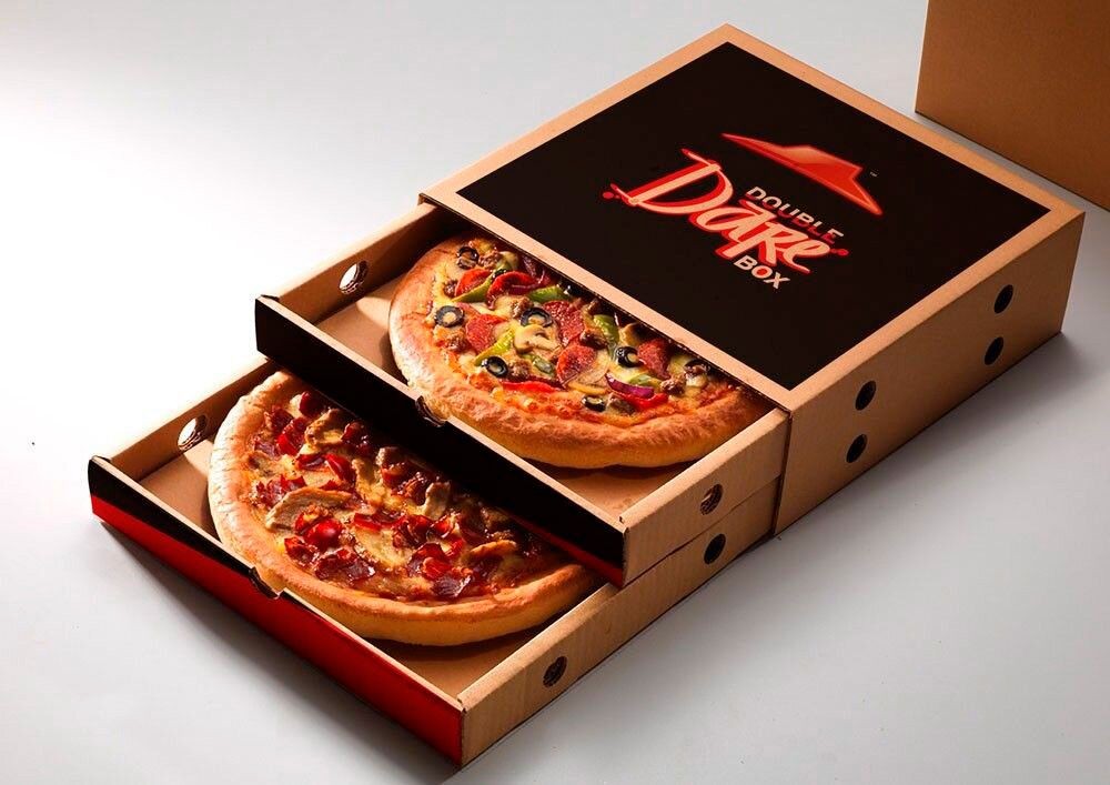
Visual design has a strong effect on how customers see a brand. In the food industry, packaging is as important as taste. The box carrying the pizza plays a silent but powerful role in shaping thoughts and emotions. Graphics on the surface often build the first impression before the food is even tasted. Below, we will explore how these designs guide customer perception in detail.
The Power of First Impressions
The first contact a customer has with a pizza is often through its packaging. Before the smell or flavor reaches them, the look of the box speaks volumes. Graphics play a huge role in forming this early judgment. Bright colors, bold fonts, and creative art signal energy and excitement. On the other hand, dull or plain visuals may leave customers underwhelmed.
People tend to link the design to the quality of the product. A box with modern, clean graphics suggests freshness and care. A messy or faded design may create doubt about hygiene and standards. This psychological link is natural. Human brains are wired to make snap judgments from visual cues.
In marketing, this instant recognition is critical. Customers often share food with family or friends. A box that looks appealing can start conversations and even attract new buyers. Restaurants know this well and invest in unique graphics to stand out in a crowded market.
The overall look also builds anticipation. When a customer sees a pizza box with a stylish logo and strong visuals, excitement grows. The eating experience begins in the mind, not the mouth. That is why the choice of design is more than decoration—it is strategy. In short, first impressions formed through graphics can directly influence taste expectations, brand loyalty, and repeat sales.
Color Psychology and Emotional Triggers
Colors are more than decoration; they trigger emotions and guide choices. Red is often linked with energy and appetite. Many brands use it to stimulate hunger. Yellow represents warmth and joy. When combined, these colors can create excitement and happiness around food. Green often signals freshness or health. Some businesses use it to suggest natural ingredients or eco-friendly practices.
Blue, while calming, is less common in food packaging. It can reduce appetite, so it is rarely the main tone. Black and gold, however, suggest luxury and premium quality. Customers may see such boxes as a sign of exclusivity. This emotional response influences how they judge the product before tasting it.
The background color of a pizza package shapes perception. For example, a rustic brown shade may suggest tradition and wood-fired ovens. A sleek white surface signals cleanliness and simplicity. Both can appeal to different groups, but each tells a story.
Emotions tied to colors also affect brand memory. People recall food more easily when they connect it with strong visual impressions. Over time, these colors become linked to the eating experience itself. A company that maintains consistency in its design builds recognition and trust.
Typography and Brand Personality
Fonts may seem small details, but they carry big meaning. Typography shapes how a brand speaks visually. A bold, heavy font shows confidence and strength. A script font appears friendly, personal, and sometimes traditional. Clean sans-serif styles feel modern and fresh. Each choice gives the box a unique personality.
Typography also affects readability. Clear, well-spaced letters help customers notice brand names quickly. If the writing is cluttered or too stylish, the message may get lost. This can hurt recall value, as people may struggle to identify the brand later.
Beyond the logo, other text elements matter. Words like “fresh,” “authentic,” or “handcrafted” placed in elegant fonts strengthen the message. Customers often connect the look of the text with the promise it makes. For instance, a rustic font paired with words about tradition makes the food feel more homemade.
Typography can also connect with cultural meaning. For example, using Italian-style lettering immediately links the product to its roots. Customers associate such design with authenticity. This creates an emotional bridge between the eater and the brand’s story.
Cultural Symbols and Local Identity
Symbols are powerful in shaping perceptions. They connect customers to culture, tradition, and shared identity. On food packaging, cultural icons often trigger trust and familiarity. For instance, a design that shows wood-fired ovens, Italian flags, or village landscapes reminds people of traditional roots.
Local symbols also build emotional ties. A restaurant that uses regional landmarks or folk art on its box sends a message of community pride. Customers often feel more connected when they see their culture reflected. This strategy can be very effective for small businesses competing with global chains.
Symbols also create instant recognition across languages. A steaming pizza illustration or a chef’s hat image can deliver meaning without words. These visuals cross barriers and appeal to diverse groups of people. This universality is one reason symbols are key in food marketing.
The risk lies in misuse. Inaccurate or offensive symbols can create distrust. Customers may feel that the brand is not genuine. That is why research and sensitivity are crucial when choosing cultural graphics. Authenticity is always more effective than generic design.
Storytelling Through Visual Design
Storytelling is not only for words—it happens through design as well. Graphics can communicate a journey, a value, or an origin story. Customers often enjoy knowing where their food comes from and how it is prepared. Designs that show farms, chefs, or kitchens make the meal feel more personal.
A strong narrative adds depth to the brand. For example, images of wheat fields may suggest natural ingredients. Illustrations of smiling families can highlight togetherness. Even abstract art can suggest energy or passion. These visual stories make the eating experience richer.
Customers respond strongly to stories because they create emotional bonds. A box that tells a tale of tradition or craftsmanship feels special. People may even choose it over competitors because of this unique story.
Consistency across design also matters. When graphics tell the same story across all products, trust grows. Over time, the brand becomes recognizable, even from a distance.
Minimalism and Modern Aesthetics
In recent years, minimalism has grown popular in design. Clean lines, simple colors, and uncluttered surfaces create a modern look. Customers often link minimal design with high quality and elegance. A plain background with a small logo can appear premium and stylish.
Minimalism also improves readability. Without too many graphics, the focus stays on the brand name and key message. This clarity appeals to customers who prefer simplicity over excess. It also stands out in a market where many competitors use busy designs.
Modern aesthetics often pair minimalism with eco-friendly materials. The design signals responsibility and awareness. Customers today appreciate brands that care about the environment. A simple design on recycled material communicates honesty and trust.
However, minimalism does not mean empty. It requires balance and smart choices. The right color and font can make a simple box powerful. Too plain, however, may feel unfinished or boring. Successful minimal design blends simplicity with personality.
Use of Interactive and Engaging Graphics
Modern technology has brought new life to packaging. Interactive graphics turn a simple surface into an experience. QR codes, for example, link customers to menus, discounts, or stories about ingredients. Augmented reality designs allow people to scan boxes with phones and see animations.
These engaging elements make customers feel involved. They create fun moments beyond eating. Sharing these experiences on social media spreads brand awareness. Businesses often use such strategies to reach younger, tech-savvy audiences.
Games, puzzles, or hidden messages printed on the surface also add value. Families and children enjoy these small touches. They extend the time spent with the product, deepening the bond with the brand.
The key to interactive design is balance. Too many elements may clutter the surface. The graphics must remain clear and easy to follow. When done right, however, they elevate the product beyond food. Customers remember the interaction long after the meal is over.
Environmental Messaging and Green Graphics
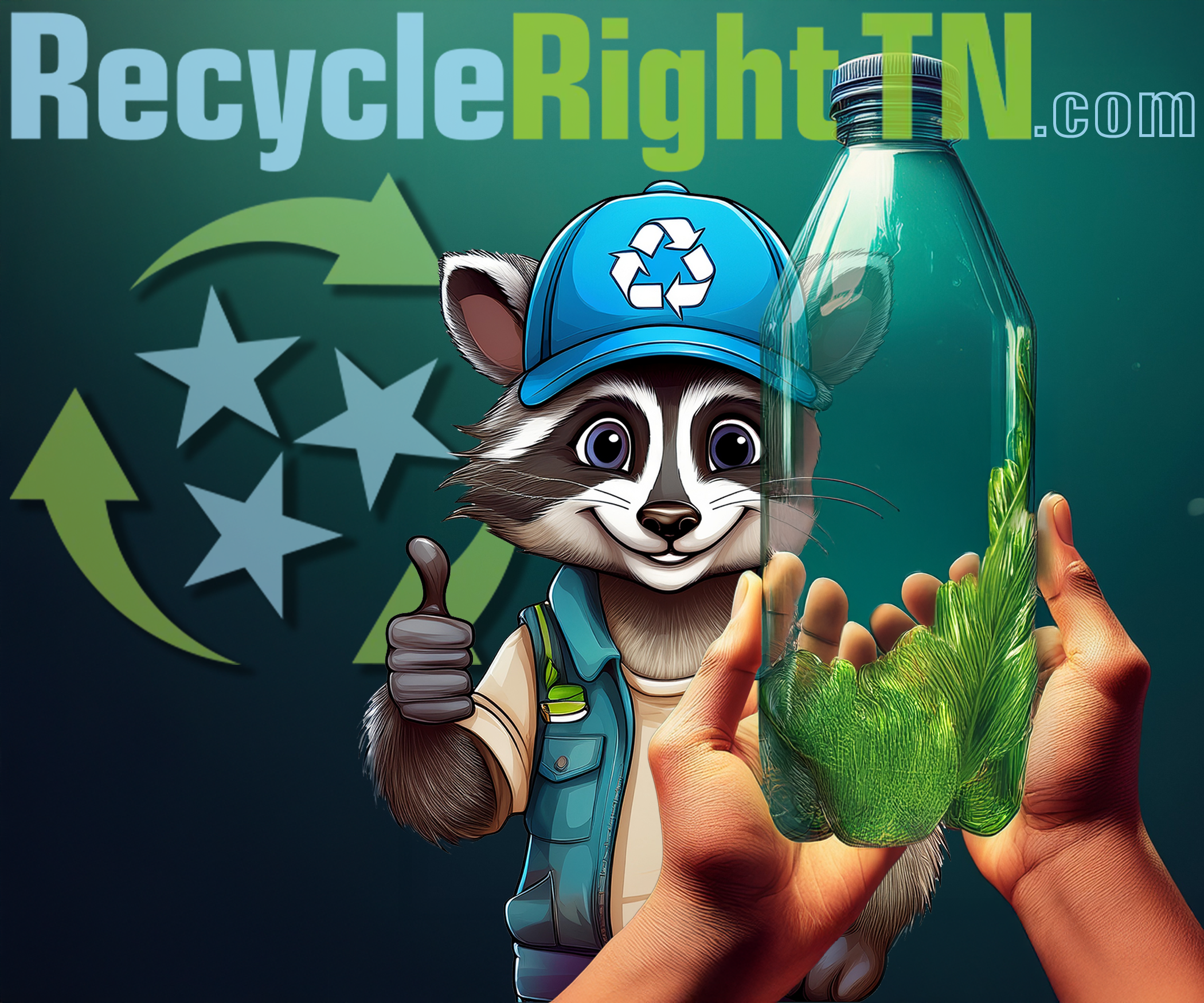
Eco-consciousness is growing worldwide. Many customers prefer brands that show responsibility toward the planet. Packaging graphics often carry this message. Green shades, leaf symbols, and recycling icons all signal care for the environment.
When customers see these signs, they feel better about their purchase. They believe they are supporting a business that shares their values. For younger generations, this factor is especially important. They often choose eco-friendly brands over cheaper options.
Clear messaging is vital. Graphics that explain the recyclable nature of the material build trust. Words like “compostable” or “made with recycled paper” reassure buyers. Transparency in design increases credibility.
The visual link between green graphics and natural care is strong. Customers often see eco-friendly packaging as healthier, even if the product inside is unchanged. This perception shows the power of design in shaping behavior.
Influence on Customer Loyalty and Buying Decisions
Graphics do more than attract attention; they guide long-term loyalty. When customers repeatedly see appealing designs, they form strong mental links. Over time, these links influence buying decisions. People often choose familiar visuals over unknown ones.
A strong design creates a sense of trust. Customers believe that a brand that invests in presentation also invests in quality. This trust often turns into repeat purchases. In fact, many loyal buyers admit that packaging plays a role in their choices.
Design also affects social influence. A well-designed box shared on a dinner table or social media spreads brand visibility. People may try the product simply because they were drawn to the design others displayed.
For businesses, this means design is not just decoration. It is a long-term investment in building relationships. A box with consistent, attractive graphics can increase sales and brand strength over years. Customers see it not as disposable packaging, but as part of the food experience itself.
Conclusion
Graphics on food packaging are far more than decoration. They influence how customers see, feel, and remember a brand. From the first impression to long-term loyalty, visuals guide emotions and choices. Colors spark appetite, fonts express personality, and cultural symbols create trust. Storytelling through design builds deeper connections, while minimalism and modern aesthetics reflect style and quality. Interactive graphics add fun, and eco-friendly visuals show responsibility. Together, these elements transform simple packaging into a tool for brand growth.